
Algorithm Science
Trading Strategy Discovery
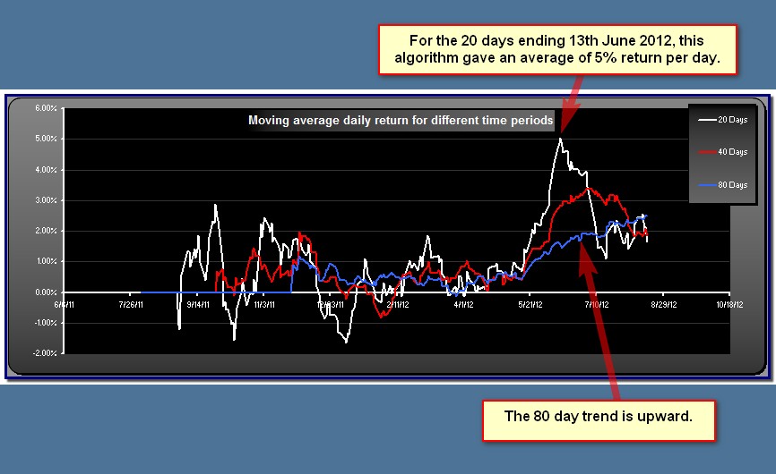
The "Moving average daily return" graph shows how the average return of the spotlighted algorithm has changed over time. Default periods are 20, 40 and 80 days (you can change these by changing the settings on the Analysis tab under Sliding Returns). For any available date you can hover over the graph to see what the average return was for the previous 20, 40 or 80 days.
This gives you insight into how well the algorithm is still working, and when most of the gains were made. If you see a peak early on, and the graphs are in decline, this is probably not an algorithm that is still working. On the other hand, if the gains have been constantly positive, or are increasing, it would indicate a strategy that has worked well in recent times.
This gives you insight into how well the algorithm is still working, and when most of the gains were made. If you see a peak early on, and the graphs are in decline, this is probably not an algorithm that is still working. On the other hand, if the gains have been constantly positive, or are increasing, it would indicate a strategy that has worked well in recent times.
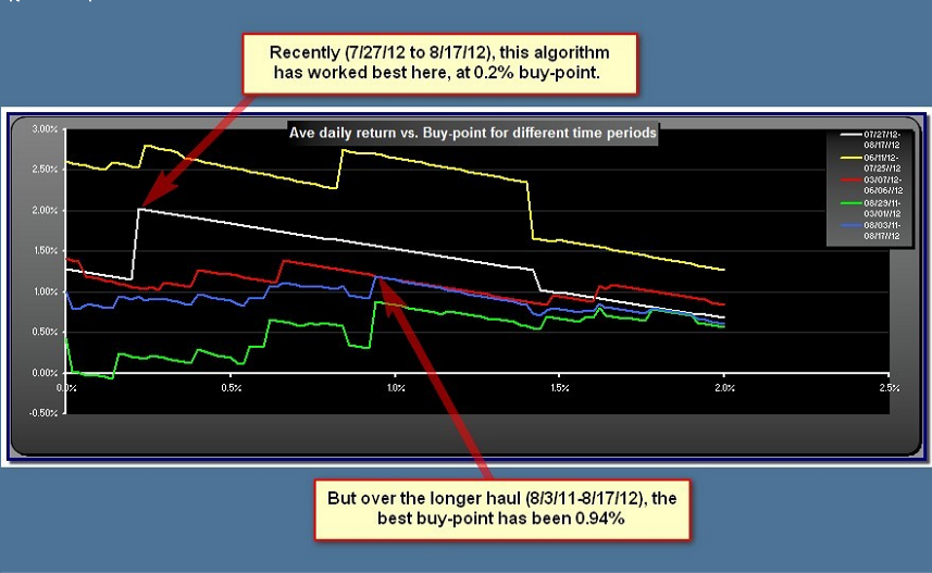
These graphs gives clues as to how the optimum buy point or sell-point has changed over time. The average daily return is shown plotted against the buy/sell point over the range setting in the Control panel. Default settings are to show days 1->15 (white), 16->49 (yellow), 50->115 (red), 116->264 (green) and 1->264 (blue), where day 1 is the most recent day. You can change these defaults on the Analysis Tab under "Longievity Analysis" settings. Use these graphs to find the most consistent buy and sell points.
Note that if buy%=sell% is "Yes", the sell point graph is inactive.
Note that if buy%=sell% is "Yes", the sell point graph is inactive.